Description
Week 2 – Graphing and Describing Data
| Week | Assignments | Due Date |
| Week 2 | Graded Discussion | Due Date—
Responses: Sunday of Week 2 [Have two posts on two different days] |
| Knewton Homework Assignments
Frequency Tables (Section 2.1) Frequency Tables & Histograms (Section 2.1) Stem & Leaf (Section 2.1) Line & Bar Graphs (Section 2.1) |
Sunday of Week 2 | |
| Knewton Quiz #1
· Covers Week 1 – 2 Material · 25 Questions · 2 Attempts |
Sunday of Week 2 |
—————-
Week 2 Assignment – Line and Bar Graphs
Objectives
2.6 Line and Bar Graphs
- Create and interpret bar graphs
- Create and interpret line graphs of data
Activity 1
Question
The data listed below represents the distance from a city taxi depot (to the nearest mile) by the number of hours since a taxi left the depot to pick up passengers.
| Number of Hours | Number of Miles |
| 0 | 0 |
| 1 | 3 |
| 4 | 6 |
| 5 | 10 |
| 6 | 5 |
| 7 | 3 |
| 10 | 2 |
Create the corresponding line graph to represent this data below.
Provide your answer below:
Answer
Access the entire solutions for this week (top graded solutions) by clicking the ‘Buy’ button.
Activity 2
Question
According to the information above, which of the following is an appropriate analysis of the taxi’s distance?
Select the correct answer below:
- From the data, the taxi was closest, in miles, from the depot after 10 hours.
- From the data, the taxi was farthest, in miles, from the depot after 4 hours.
- From the data, the taxi was closest, in miles, from the depot after 5 hours.
- From the data, the taxi was farthest, in miles, from the depot after 5 hours.
Answer
Access the entire solutions for this week (top graded solutions) by clicking the ‘Buy’ button.
Activity 3
Question
The bar graph below shows the number of men and women in different clubs.
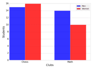
Provide your answer below:
Answer
Access the entire solutions for this week (top graded solutions) by clicking the ‘Buy’ button.
Activity 4
Question
The bar graph below shows the number of men and women in different classes.
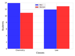
Provide your answer below:
Answer
Access the entire solutions for this week (top graded solutions) by clicking the ‘Buy’ button.
Activity 5
Question
Gail is a car salesperson, who keeps track of her sales over time. The line graph below shows the data for the number of cars she sells per week.
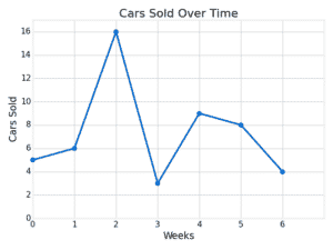
At what week were her sales 8? Do not include the unit in your answer.
Answer
Access the entire solutions for this week (top graded solutions) by clicking the ‘Buy’ button.
Activity 6
Question
Porter is keeping track of the total number of books he has read over time. The line graph below shows the data.
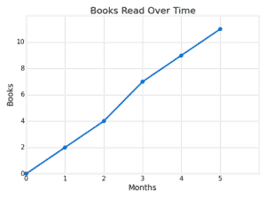
How many books did Porter read from month 2 to 5? Do not include the unit in your answer
Answer
Access the entire solutions for this week (top graded solutions) by clicking the ‘Buy’ button.
Activity 7
Question
The bar graph below shows the number of men and women in different classes.
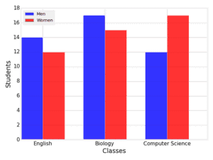
How many total students are in the computer science class? Do not include the units in your answer.
Answer
Access the entire solutions for this week (top graded solutions) by clicking the ‘Buy’ button.
Activity 8
Question
A gym is conducting research on their customer’s preferred work-out routine during the week. The following table shows the preferred work-outs for the selected gym customers.
| Activity | Frequency |
| Running | 22 |
| Swimming | 16 |
| Walking | 11 |
| Weight Lifting | 8 |
| Aerobics | 5 |
Create the corresponding bar graph to represent this data below. Drag the dots on the top of the bar graph to create the chart.
Answer
Access the entire solutions for this week (top graded solutions) by clicking the ‘Buy’ button.
Activity 9
Question
If the gym was going to expand only one part of their gym to provide more space, which area should they most likely expand?
- According to the data, the gym should expand the pool.
- According to the data, the gym should expand the weight room.
- According to the data, the gym should expand the runner’s track.
- According to the data, the gym should expand the aerobics room.
Answer
Access the entire solutions for this week (top graded solutions) by clicking the ‘Buy’ button.
Activity 10
Question
Alice is keeping track of the total number of books she has read over time. The line graph below shows the data.
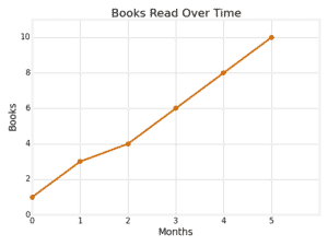
How many books did Alice read from month 2 to 3? Do not include the unit in your answer.
Answer
Access the entire solutions for this week (top graded solutions) by clicking the ‘Buy’ button.
Activity 11
Question
Marc is keeping track of the total number of movies he has watched over time. The line graph below shows the data where the number of movies corresponds to the number of movies that had been watched at the beginning of the week shown on the horizontal axis.
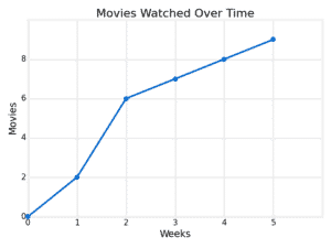
How many movies did Marc watch between the beginning of week 1 and the beginning of week 5? Do not include the unit in your answer.
Answer
Access the entire solutions for this week (top graded solutions) by clicking the ‘Buy’ button.
Activity 12
Question
Julie is keeping track of the total amount of money she has saved over time. The line graph below shows the data.
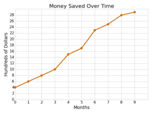
At what month did Julie’s savings reach $2300?
Answer
Access the entire solutions for this week (top graded solutions) by clicking the ‘Buy’ button.
Activity 13
Question
The data listed below represents the growth of a plant (in inches) by the length of time music was played (in hours).
| Music Length (in hours) | Plant Growth (in inches) |
| 0 | 0 |
| 3.2 | 1.2 |
| 4.6 | 3.4 |
| 5.2 | 4.9 |
| 6.1 | 5.4 |
Create the corresponding line graph to represent this data below.
Answer
Access the entire solutions for this week (top graded solutions) by clicking the ‘Buy’ button.
Activity 14
Question
According to the information above, which of the following is an appropriate analysis about plant growth and music?
Select the correct answer below:
- From the data, when the length of music decreased, the plant grew taller.
- From the data, the plant’s growth remained constant as the length of music increased.
- From the data, when the length of music increased, the plant grew taller.
- This information cannot be determined from the graph.
Answer
Access the entire solutions for this week (top graded solutions) by clicking the ‘Buy’ button.
Activity 15
Question
A travel agency is conducting research on how many times families went on vacation during the last year. The following table shows the number of times sampled families went on vacation.
| Vacation | Frequency |
| None | 3 |
| Once | 11 |
| Twice | 9 |
| Three times | 6 |
| Four times | 3 |
Create the corresponding bar graph to represent this data below. Drag the dots on the top of the bar graph to create the chart.
Answer
Access the entire solutions for this week (top graded solutions) by clicking the ‘Buy’ button.
Activity 16
Question
According to the given data, what can the travel agency conclude about the sampled families?
Select the correct answer below:
- According to the data, a majority of the sampled families did not go on vacation.
- According to the data, a majority of the sampled families went on vacation twice.
- According to the data, a majority of the sampled families went on vacation no more than once.
- According to the data, a majority of the sampled families went on vacation at least twice.
Answer
Access the entire solutions for this week (top graded solutions) by clicking the ‘Buy’ button.
Activity 17
Question
Josslyn is a car salesperson who keeps track of her sales over time. The line graph below shows how many cars she sells per week.
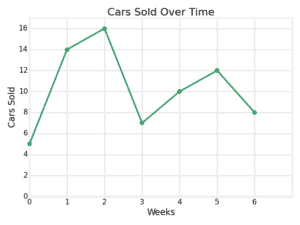
What was the change in cars sold from week 2 to 6? Do not include the unit in your answer.
Provide your answer below:
Answer
Access the entire solutions for this week (top graded solutions) by clicking the ‘Buy’ button.

![[Top Answer] MATH225N - Week 2 Assignment Line and Bar Graphs](https://prolifictutors.com/wp-content/uploads/2022/07/Top-Answer-MATH225N-Week-2-Assignment-Line-and-Bar-Graphs.jpg)


Reviews
There are no reviews yet.